SmarttBot
Automated investments on the Stock Exchange
As the only Product Designer on the team, my role was to go through the entire discovery process, interviews with stakeholders, collecting customer service and navigation data, creating the prototype using Adobe XD and delivering it to the development team. I also worked in the design operation focused on the scale of the components created for implementation in React.
Oct 2017 - Jun 2018
Design System, Visual Design,
User Interview, Prototyping, User Testing
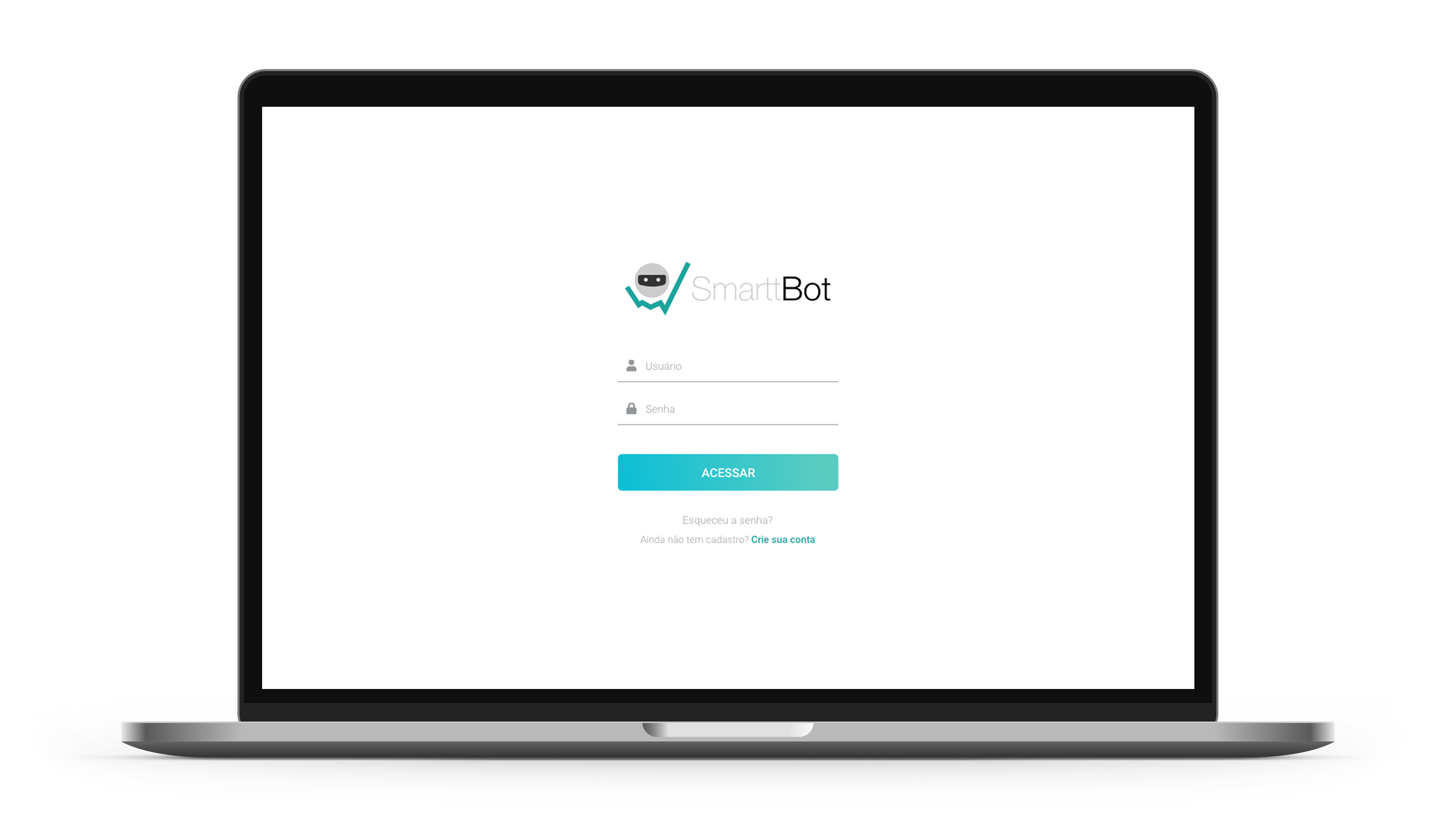
The construction project for SmarttBot's investment platform involved a drastic change, both visual and structural, in relation to the first existing layout. Some references were adopted to make work more effective with less execution time.
"Risk comes from not knowing what you're doing." - Warren Buffett
This phrase from one of the greatest investors of all time reflects the concept of this new platform well. Users need to be able to see everything that is happening with their money and be able to act if necessary.
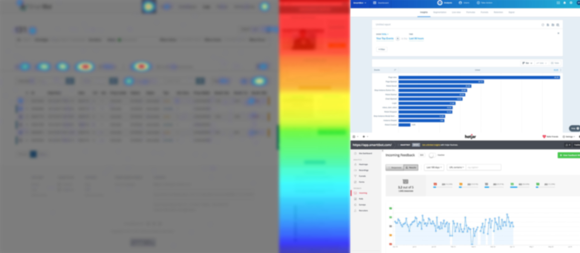
The best way to understand what is happening is to join the Customer Service team and get the best feedbacks. Along with that, it was possible to get several insights based on data from the most diverse sources.
Some problems have been identified through the user experience with the platform. A high number of people had difficulties in understanding the operations of the robots, balance, environment (real or simulated) that the robot was created. Many clients were not professional traders, that is, they had other professions and did not spend all day following the market. For this, the Mobile First concept was used to build the components and final structure of the platform.
When people need to diversify their investment portfolios, the market offers different possibilities. One of them is an automated operation by investment robots that execute previously configured or acquired. The focus is not having to spend the whole day watching the ups and downs of the market and dedicating more time to other activities.
The idea was to build a web platform that the user could follow the operations of the robots, buy strategies or configure the robots on their own. An experience that contemplates both the journey of a professional user and lay users.
In order to understand the important points in the user's journey, navigation flows and identification of relevant touchpoints for conversion into the company's products were made..
To speed up the creation of screens and features, consistency in the interface and agility in possible future updates, a series of design principles was developed to support the entire scope that already existed with the first platform and bring even more usability.
A color palette was established with shades that already existed in the company's identity, some states were added so that the user could visually understand the use of the platform. (Whether he is getting rich or poor)
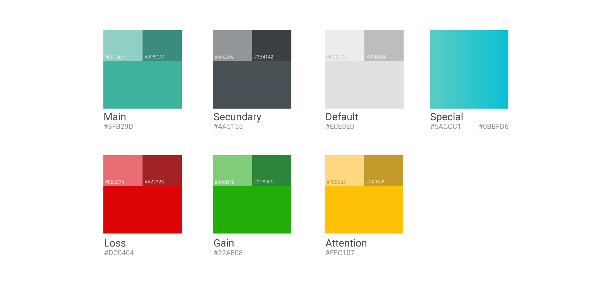
It took some experiments to decide the colors, as there were times when using the platform when the user needed to pay attention, otherwise he could lose money. At the same time it was necessary to inform the daily gains or losses for him to decide what to do, stop operating or continue with his robots on.
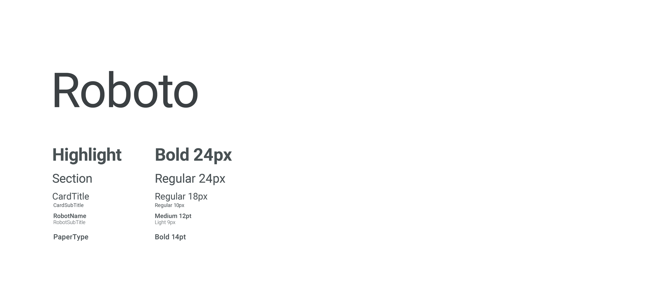
Having chosen to work with Material Design as a visual language, we took advantage of its main source to use on the platform. Roboto is a very open and geometric font, very good for representing numbers clearly.
An investment platform needs to be intuitive and clear, and one of the strategies used was the creation of structures to be used throughout the user's journey. Making him understand the function of a specific feature regardless of which screen he is on.
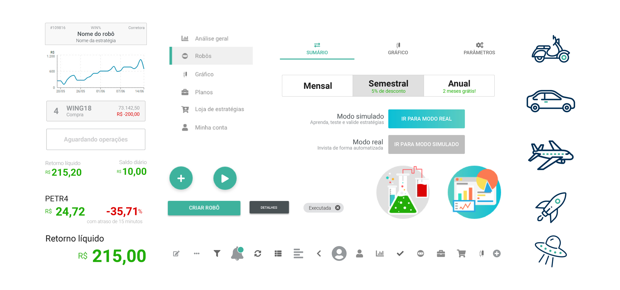
To consolidate all the strategies described, more complex components were created and actions were inserted in them. They also help with content segmentation and sequentiality since each card has a different context from the other.
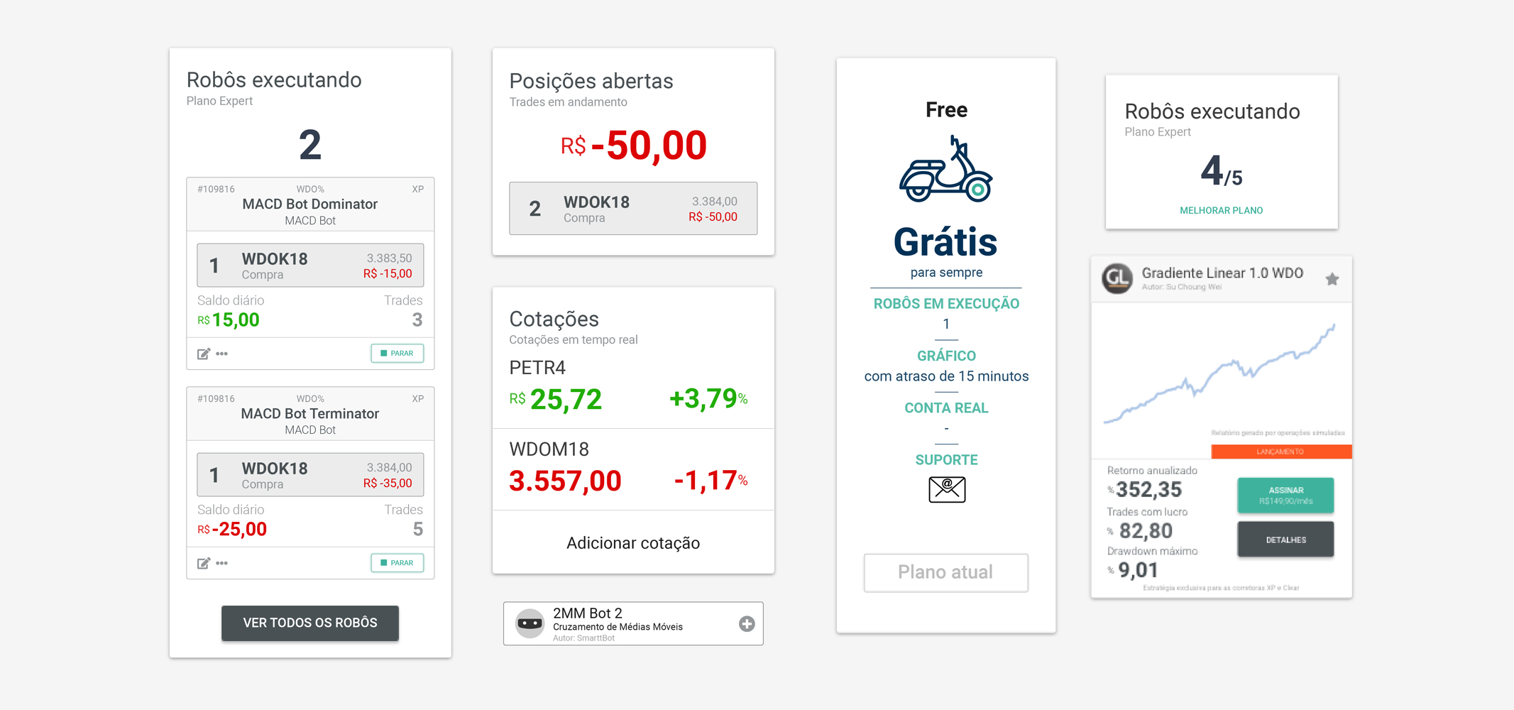
There are some requirements when it comes to an investment platform, for that reason some strategies were used to make navigation more fluid and natural for the user, always making it possible to reach the next step.
An entry on the platform segmented by type of customer and sequential, designed to show the benefits and convert customers who have not yet paid for services.
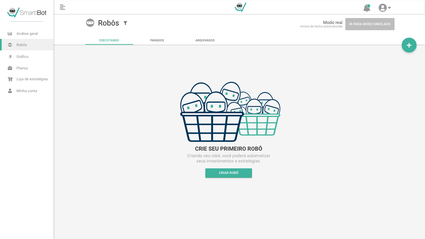
Used to guide the user at times when there is no content to be shown, empty states help a lot of users who have just entered the platform and do not know what can be done, or to report an error on the platform.
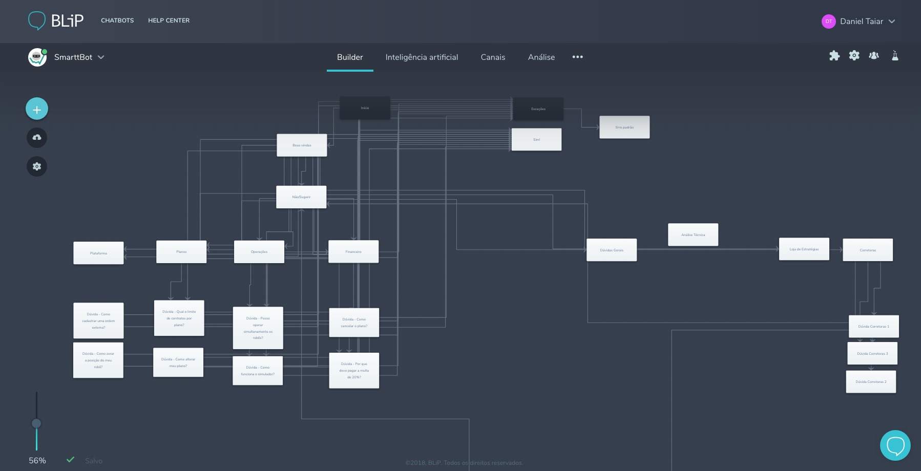
There are several types of chatbots, but what was implemented for the new platform was a bot to answer the main questions users have regarding SmarttBot. Along with Costumer Service team, the main doubts were raised and a platform named Blip was used, a tool offered by another startup called Take, in the construction.
Many of the platform's users do not work with investments in a professional manner, many have other professions as their main source of income and most of the time, they do not stay in front of the computer following the scholarship during the day. Therefore, a mobile version was designed with the main functions that the user during the day, just a scroll to view how the robots are and act, if necessary.
Various usability concepts were used througH the platform for a better experience in using the platform. That way, the user will always know what to do if he finds himself in a moment of doubt along his journey.
After a lot of experimentation and many usability tests with customers and employees, we arrived at a consistent platform version, a clean and functional product, with several UX concepts and usability for a consistent and reasoned delivery in several ways. And I believe I managed to fulfill a mission to deliver a great user experience!
Double the number of customers in 6 months.
Users have come to understand the product more and use it better.
The modular solution made the layout include new releases.
There were many lessons learned through the process: